

Pattern Play: How to Use Patterns Effectively in Print
In the dynamic world of print design, patterns are not merely decorative accents; they are powerful tools that can transform a print project from ordinary to extraordinary. Whether gracing the pages of a brochure, adorning the walls of a printed poster, or enriching the texture of a business card, patterns have the unique ability to captivate, communicate and enhance the visual appeal of printed materials. They are key in print, transforming cookie-cutter designs into unique creative platforms that can elevate your business or personal project. However, the trick to using patterns effectively in the printing industry lies in understanding their purpose and applying them with precision and intent.

Pattern Definition
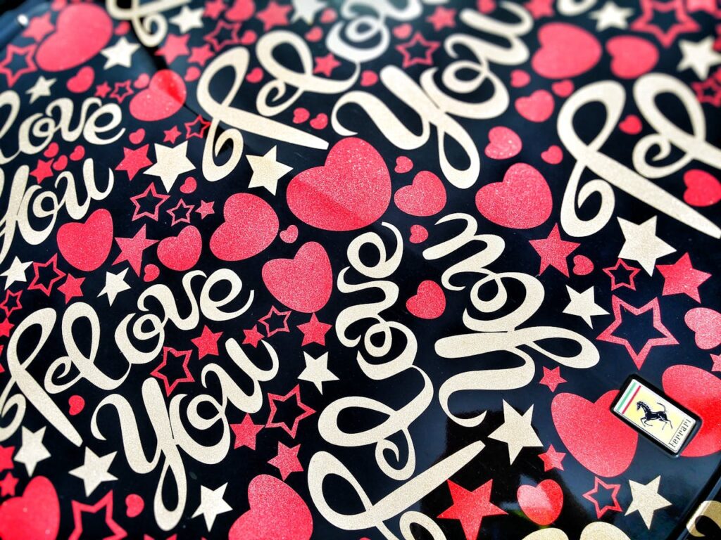
In design, patterns are structured elements/shapes/colours repeated in a particular arrangement, creating a recognisable visual sequence. Several styles can be used:
Geometric shapes that repeat, seemingly irregular or chaotic designs still within a repeatable structure, or more complex designs that blend several styles.

Patterns can be repeated indefinitely, with continuity, which is a part of its mere definition. They can be applied to any design and material without the size being a presenting issue.
We are drawn to patterns because they are found everywhere, most notably in nature. Just look around you and you’ll find patterns in places you least expect them. The coats and feathers of animals, the cells found in a beehive, a tree trunk, or the structured patterns in a simple leaf.
What is the Role of Pattern in Print?
Patterns affect the overall impact, design and finish of a print project. They can change the message entirely with the brand’s visual guidelines. They can confuse the viewer, overwhelm them, or sometimes fade entirely into the background.
When done correctly, they add harmony, consistency and an overarching sense of unity to the design. The pattern isn’t necessarily noticed by the viewer in its own right, but as part of a cohesive narrative, strengthening the effect of your desired message.
Don’t underestimate the role of a pattern in a print. Most designers will spend far too much creative energy on what they think is the key element, the primary ‘actor’ in the design, the focal point, but that leaves a big opportunity to give depth to a design, infusing life into a print, enhancing the influence on your target audience.
Picking the Right Pattern
Choosing the right pattern is crucial, as it sets the tone and impacts the overall perception of the printed piece. Keep in mind that there is no one-size-fits-all approach. In the printing industry, the selection of patterns should be aligned with the project’s purpose and the client’s brand identity.
Selecting a pattern based on personal preferences is the most common mistake that most people make; even graphic designers are prone to it. We look at what ‘looks good’ and believe that’s it, that’s all that’s needed, it looks good. But, this very well may not be the best and most effective approach.
First, you must be clear about the context. What is the message that you are looking to convey? Think carefully about your specific set of goals, your target audience and commercial space (is it a flyer, a billboard or a newsletter).
Your pattern also does not stand alone; rather, it will have a close correlation with other design elements and any text on the print. Think about how your pattern fits in. Will it simply be used as a complementary background, a guide for your viewer, or the main focal point.

Pattern Styles
As briefly noted, there are many types of patterns available to you, here is a list of some of the most common styles:
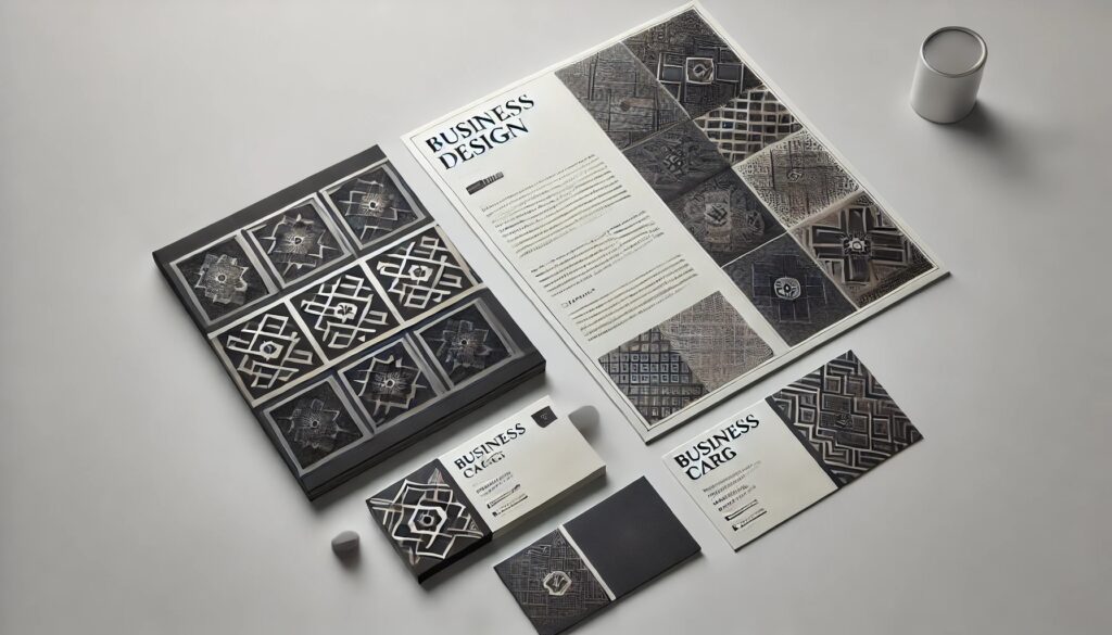
Geometric patterns use basic shapes to build a structure, with a clear symmetry that is recognisable and familiar.
Illustrated patterns, tend to feel a little more personalised and unique, with the type of illustration giving a specific look and feel. You might wish to consider a limited colour scheme, so as not to overwhelm the viewer.
Marbled patterns go back centuries, but have been making a popular comeback in recent yers. They are often used in toiletries, candles and other products that exude relaxation. This pattern style is very versatile and can be used in a variety of settings.
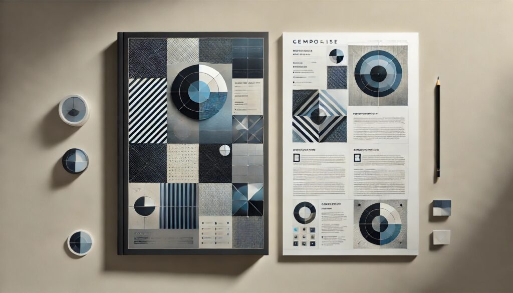
Monochromatic patterns have strength in their simplicity, oozing professionalism and harmony. Ideal for corporate prints, where an elegant and more professional message is preferred.
Patterns and Printing Quality
There is a distinct difference between designing patterns for screen and for print. Even for designers with little experience, this can be a bit of trial and error depending on the project requests and guidelines. When considering choosing to screen or print your next project, keep the following tips in mind:
- High Resolution. Patterns should be designed in the highest resolution possible. Note: in print, this will be far higher than for an average monitor/screen. If you do not do this, the print will end up pixelated and blurry. The best choice might be vector-based images that scale well without losing quality.
- Colours. The colours you see on the screen will not necessarily look identical once printed. Even the most subtle of changes can affect print quality. Speak with your printer vendor to ensure you get the correct compatibility.
- Materials. Patterns will translate differently depending on the paper used. For example, a glossy style will make your pattern design ‘pop’, whereas a matted style can have a more muted effect.
Trial run. Once you are satisfied that you have done the above, invest in a trial run, it will pay off as it will give you an exact visual of what your customers will see. A trial run allows you to see whether there are any problems, errors, or issues with the colours.
Design with Intention
The key to successful pattern design in print is understanding how they can help bring harmony to your project, ensuring you are fully engrossed in its purpose, and executing the transfer from screen to print effectively.
Patterns, when used effectively, can significantly enhance the appeal and effectiveness of printed materials. In the printing industry, where the competition for attention is fierce, the thoughtful application of patterns can differentiate your print projects, making them memorable and impactful. Ensure that you design with intent and have a purpose in your pattern selection.
Whether you’re designing corporate materials, marketing collaterals, or specialty print products, understanding how to choose, scale and colour your patterns, will ensure that your designs not only stand out but also resonate with their intended audience.
By mastering the art of pattern play, you can elevate your print designs, creating visually stunning and professional pieces that truly capture the essence of your client’s brand and message.